
Money & the World
TVs Are Dirt Cheap. Food Is Super Expensive. Why?


Wealthsimple Magazine
Conversations with geniuses and weirdos, help with investing and taxes, and stories that help you understand the big strange world we live in
Money Diaries
Anthony Bourdain
Wealthsimple
Smart investing tools and personalized advice designed to build long term wealth.

Popular right now

Canada’s Super-Secret Plan to Soar Past the U.S. Economy
Money & the World

Did You Lose Money Trading Stocks? Blame Your Caveman Brain
Finance for Humans
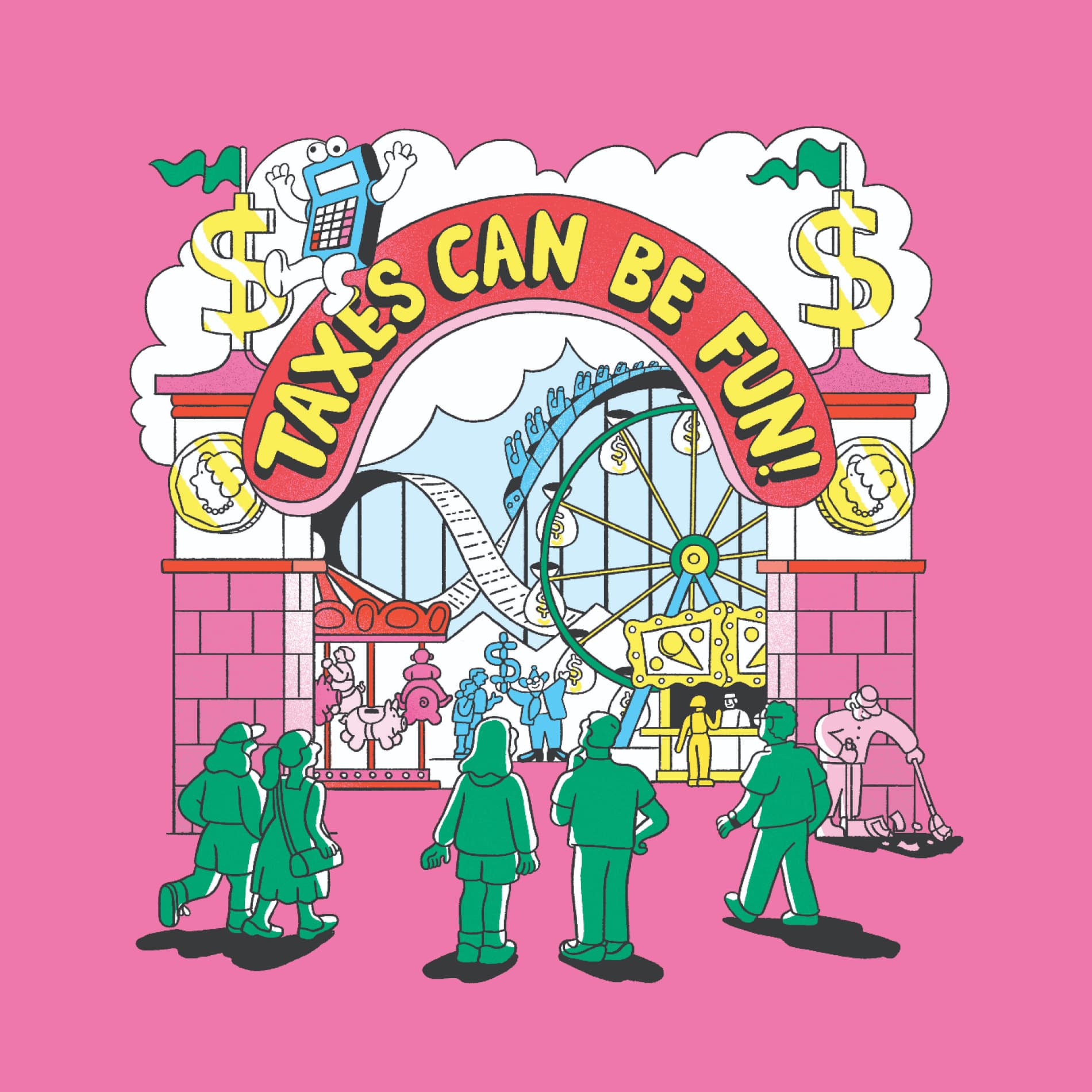
OMG You’re Having a Baby! (A Guide to That and Other Big Life Moments That’ll Affect Your Taxes)
Finance for Humans

Tariffs Are Here. How Ugly Could This Get for Canada?
Money & the World
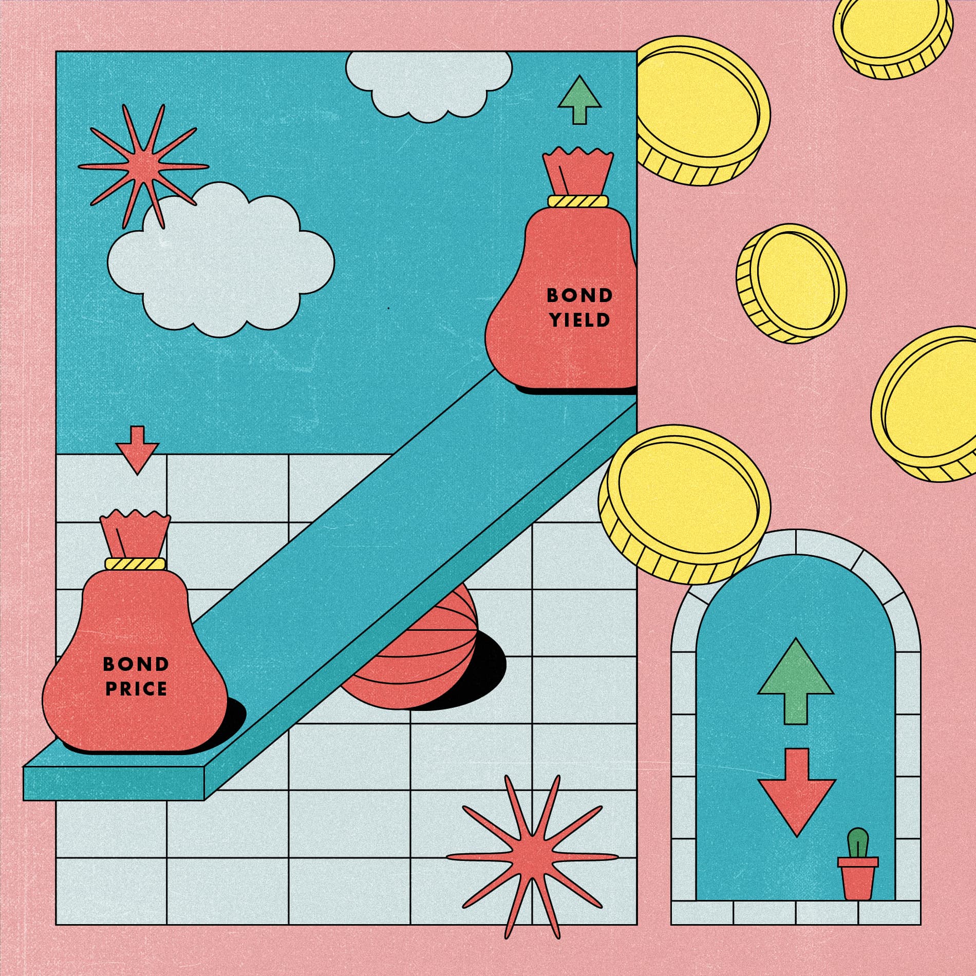
The Bond Market Fell, Hard. An Explainer for Normal Humans
Finance for Humans
Featured Topic
The latest news from Wealthsimple

The Deadline for RESPs is Coming! It's About More Than Free Money
All hail the Wealthsimple RESP! Now that we’ve eliminated the confusing paperwork and high fees, there's no good reason not to start planning for your kids' future. (The deadline is December 31)
We Were Not Living Up To Our Principles. Here's What We Are Doing About It
We believe Black lives matter. We are committed to building a more diverse team, and to supporting our Black communities.

We Built Our Portfolios to Protect Your Money In a Downturn. Here's Why it Worked
Our new portfolios outperformed our old portfolios (not to mention Canada’s largest mutual funds). Of course, no one should focus on short-term performance, but a look at why these changes worked will help you understand why not all diversification is created equal.

How Do You Bring Financial Power to the People? It’s Kind of a Good Story
Why are we telling the story of where we came from now? Because it’s got a lot to do with where Wealthsimple is going.
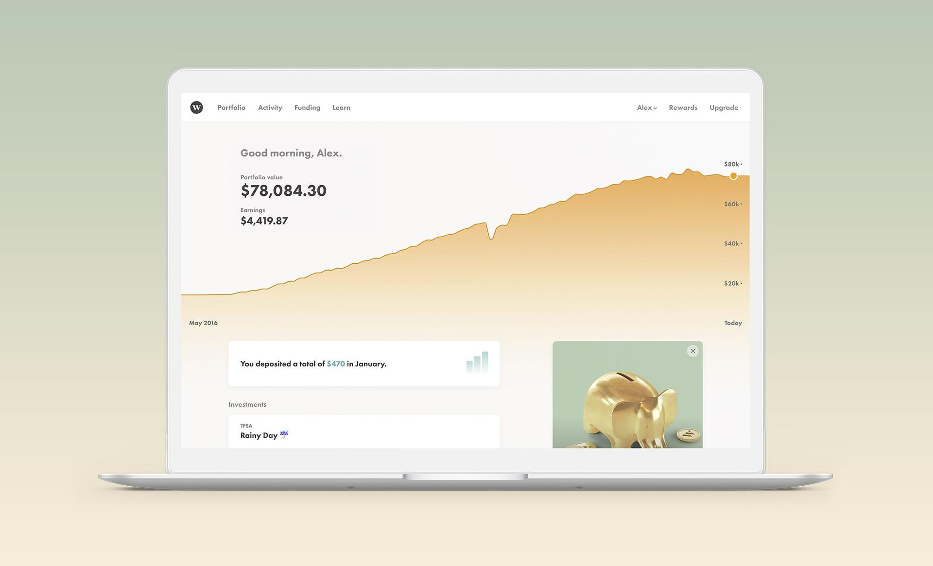
The Wealthsimple Experience Is About to Get Even Better
When you log in to Wealthsimple in the next week, things are going to look a little different. Our new experience gives you a clearer picture of where you are, so you can make better decisions about where you want to go.

The Stadium We Were Born to Sponsor
We unveiled Wealthsimple’s first sports arena. It’s gorgeous, brand new, and the size of a large Caesar salad.
Your Portfolio Just Got Even Smarter
We’ve made some really important tweaks to our investment mix, designed to help protect you in a downturn and leave you poised for better returns in the future.

Our New Round of Investment Means Smart Financial Services Are Coming for Everybody
Can a $100 million investment help change the financial industry?
Announcing the Wealthsimple Foundation
We want to help one million children from low-income families save for their education over the next 10 years. It's going to be a long journey, but we think it's an important one.

Dear Canada: It's Time For Open Banking
It might sound esoteric – or even boring. But the policy being considered by the government right now could radically improve our financial lives.
Featured Topic
Candid money stories from interesting people

To Win Four Oscars, Sean Baker Had to Go Broke Again and Again
Baker has made a career of spending his own money to tell stories Hollywood wouldn’t. It paid off at the 97th Academy Awards.

Money Diaries: Pride Edition
For the last five years, our “Money Diaries” series has been all about telling truths. In honour of Pride Month, we share some of the greatest conversations we’ve had with LGBTQ+ icons.

Roxane Gay on Financial Independence: 'The Most Important Thing a Woman Can Do for Herself'
She's the best-selling author of 'Bad Feminist' and 'Hunger.' And until five years ago she'd never saved a penny. The author on her complicated relationship with money.

How I was Conned by the “Fake German Heiress”
Rachel DeLoache Williams’ relationship with Anna Delvey began over drinks and infrared saunas, but it ended with a $60,000 bill, a grand jury, and a new understanding of friendship and financial crime.

The World Wouldn't Make a Place for Angelica Ross. So She Made One for Herself
Before she was cast on 'Pose,' she worked at Arby's and Apple. Got kicked out of the Navy and Applebee's. The winding money journey of a new type of TV star.

Emily Ratajkowski Is Not a Commodity
The actress, model and now writer tells us her money story, and all the intense contradictions about objectification it entails.

It’ll Work Itself Out (It Actually Won’t)
He’d finally achieved what he’d always wanted. He was a writer, in New York, people knew his name. But under his bed was a plastic bin that contained — in the form of bills and notices — another man entirely. An addict and a debtor. And that man had come calling.

Anthony Bourdain Does Not Want to Owe Anybody Even a Single Dollar
Before he was the guy from Parts Unknown, he was 44, never had a savings account, hadn't filed taxes in 10 years, and was AWOL on his AmEx bill. That turned out to be a great financial education.

Shangela Would Like to Remind You to Tip Your Drag Queen
The perennial crowd favorite on 'RuPaul's Drag Race' talks wig economics and why resourcefulness is a vocational imperative.

Natasha Rothwell's Character in “The White Lotus” Finds an Angel Investor. Her Real Life Didn't Quite Work That Way.
A Money Diary about subsidized housing, writing for “Saturday Night Live,” and getting into credit card debt from the actress (“Insecure”) and writer.
Featured Topic
How to be a better money person

Nervous About Overheated Stocks? Let’s Revisit Four of Our Best-Ever Insights
We combed through all the analysis we’ve published since launching this newsletter in 2022 and found four insights that feel especially relevant right now.

The Budget for People Who Hate Budgeting (and Also Want a Bidet)
It’s called the 50/30/20 rule, and it’s a tedium-free way to work toward your goals

How Do I Diversify, Anyway?
You’ve probably heard this advice before: diversify your investments or else bad things could happen! Well, how do you actually do that smartly? And why should you in the first place? We’ve got answers.

You Probably Shouldn't Panic Sell to Avoid Drawdowns
Stocks have been on an epic bull run since 2009. But there have been hundreds of rational-seeming reasons to get scared and sell your shares along the way/

OMG You’re Having a Baby! (A Guide to That and Other Big Life Moments That’ll Affect Your Taxes)
The government won’t help you raise your kid, furnish your home, study for exams, or pick the right engagement ring. But it will help you save money on all of those things.

Markets Have Been Bananas. Is It Time to Hold Defensive Stocks?
Investors tend to flock to stable (that is, boring) companies in times of turbulence. We investigated whether that’s such a good idea.
Did You Lose Money Trading Stocks? Blame Your Caveman Brain
Humans rely on evolutionary mental shortcuts to make decisions. Which is handy for escaping bears but less good for making money in markets.
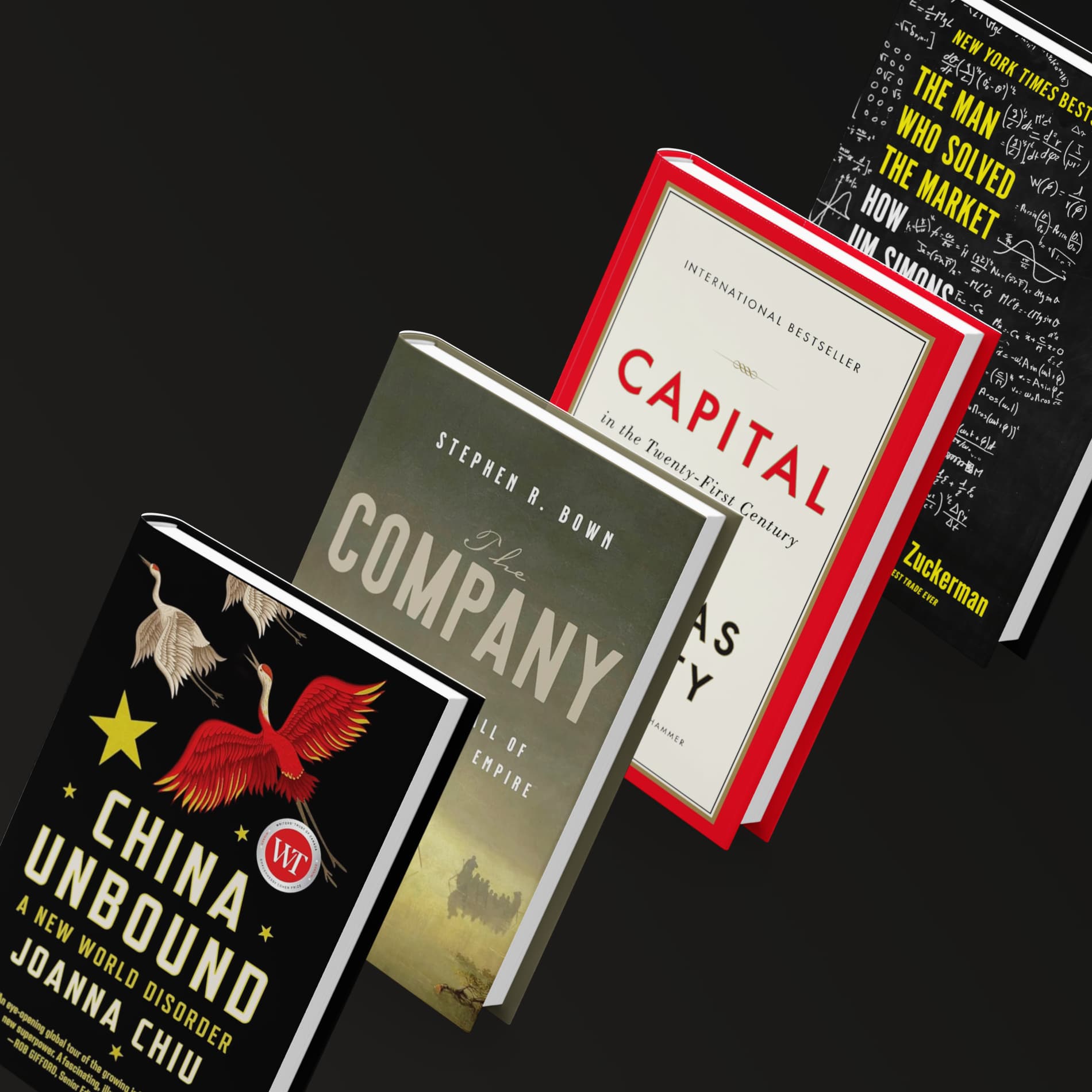
10 Books That’ll Teach You Everything (Or at Least a Lot) About Money
Want to sound smart at your next holiday party? We’ve got some reading reccos that will help.
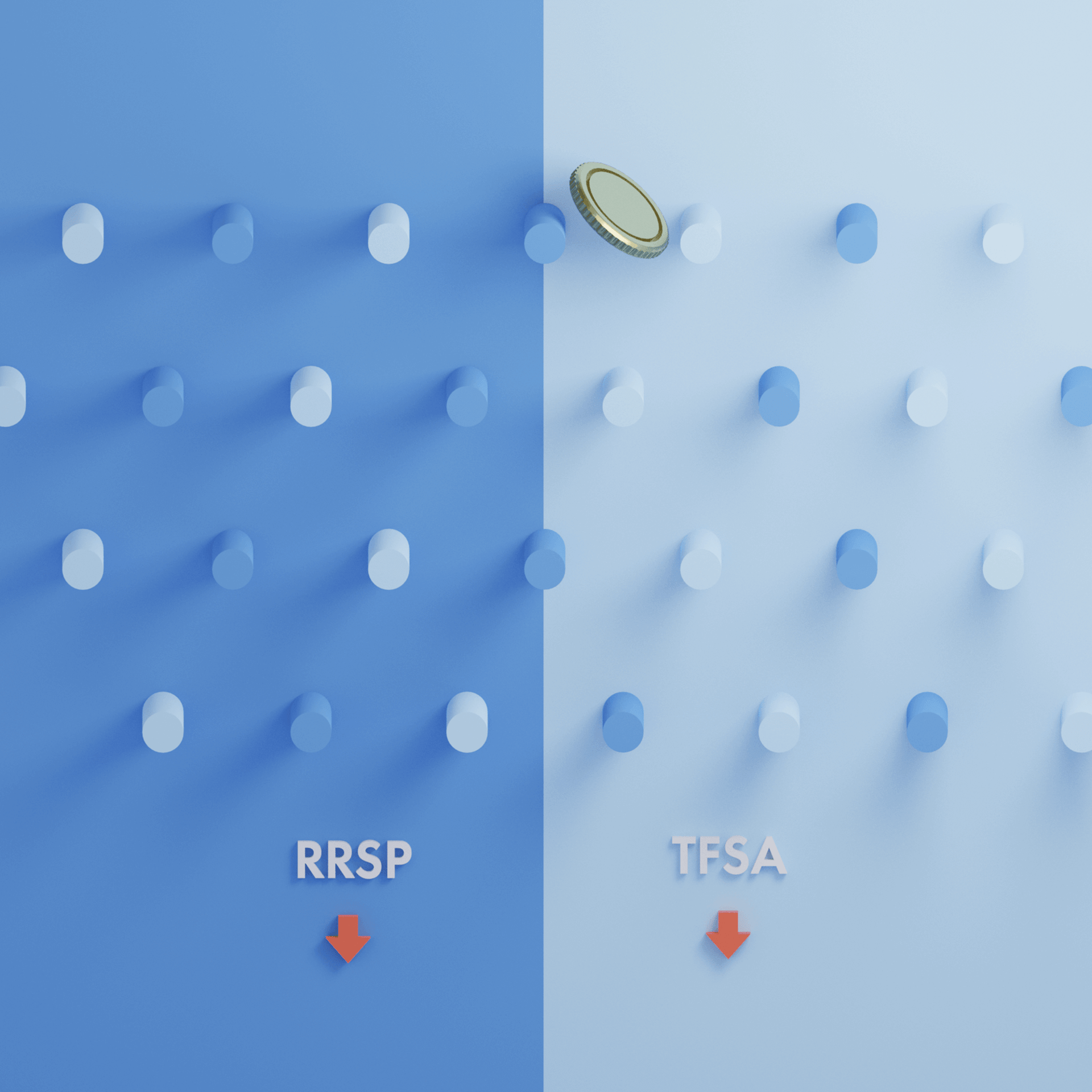
RRSP vs TFSA: What’s the Better Choice?
In this battle of the tax-sheltered accounts (and who doesn’t love to see a good fight between tax shelters?), we tell you when you should put your money in an RRSP, when you should pick a TFSA, and when you should do both (if you can!).

Five Tax Enigmas That Confuse Basically Everyone
OK, OK: they’re not technically enigmas, but these are the things most likely to trip you up when it comes time to file. We make sense of the madness and hopefully spare you some confusion.
Featured Topic
How money shapes the world we live in

TVs Are Dirt Cheap. Food Is Super Expensive. Why?
A consumer mystery explained.

How to Consume and Discern Information in Our Slop-Infested World
AI has unleashed a flood of computer-generated marker commentary. Here’s how to filter the good analysis from the bad.
The Ten Words That Defined This Topsy-turvy Year in Money
Understand these words, and you’ll be pretty much caught up on everything money-related that happened in 2025 — and well-prepared for 2026.

How Canada, and Much of the World, Got Stuck in a Land Trap
An interview with Mike Bird, the Wall Street editor for The Economist and author of The Land Trap: A New History of the World’s Oldest Asset.

The Most Compelling, Surprising, and Delightful Ideas of 2025
We share the ideas in finance, tech, and beyond that blew our minds this year.

Prediction Markets Are, Suddenly, Everywhere. Wall Street Wants In
A year ago, news-betting platforms were niche. Today, they’re increasingly stealing turf from major online sportsbooks.

Canada’s Super-Secret Plan to Soar Past the U.S. Economy
Canada has spent 2025 on its back foot. But what if this was actually our time to shine?

Tariffs Are Here. How Ugly Could This Get for Canada?
New levies on Canadian goods are expected to take effect on Tuesday. Canada has vowed to fight back. Here’s what that might mean for the economy, the country, and your money.
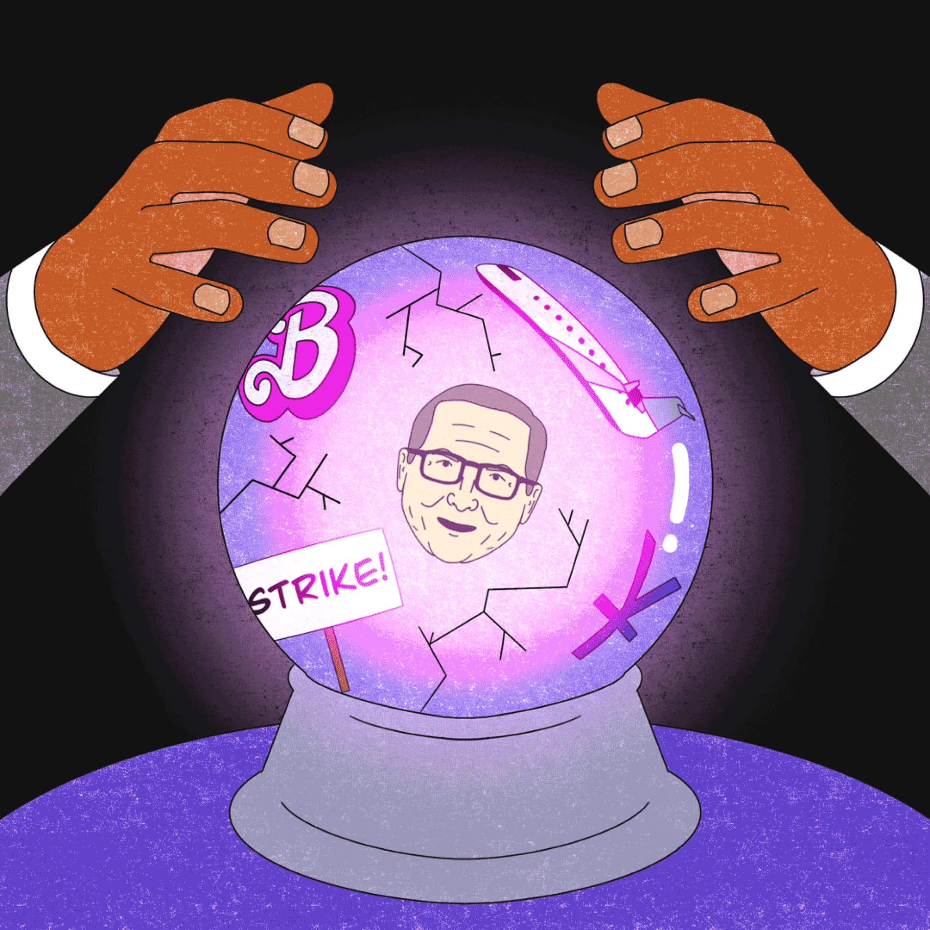
How 2023 Cracked Wall Street’s Crystal Ball
We asked Kyla Scanlon — a writer, video creator, and podcaster (surely you’ve seen her financial explainers on social media, right?) — to unpack why pro investors guessed all wrong about what would happen this year.

The Story of the Stock Market, Told by Five Companies
These stocks help to explain what the heck happened in Q3 2022.